Physical Address
304 North Cardinal St.
Dorchester Center, MA 02124
Physical Address
304 North Cardinal St.
Dorchester Center, MA 02124
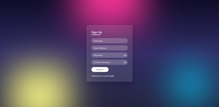
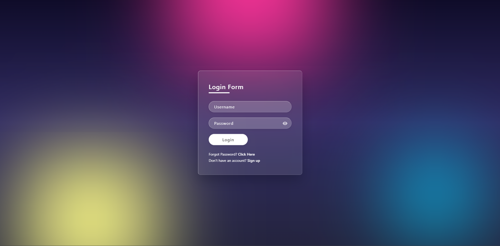
Glassmorphism Login Form design is one of the most popular trends in modern web development. In today’s digital landscape, creating a visually appealing and user-friendly login interface is essential for any professional website. Glassmorphism uses semi-transparent elements with a frosted-glass blur effect to create a premium, futuristic aesthetic.
In this tutorial, I’ll walk you through building a beautiful Glassmorphism Login Form from scratch using pure HTML, CSS, and a touch of JavaScript. The result is clean, responsive, and includes a handy password visibility toggle. Learn how to build a modern Glassmorphism Login Form using HTML, CSS, and JavaScript. Includes pros and cons, backdrop blur effects, and a password toggle.
Before diving into the code, it is important to understand the advantages and limitations of using a Glassmorphism Login Form in your UI/UX workflow.
backdrop-filter property.<div id=”features”></div>
<div id=”features”></div>
This login form features:
It’s lightweight, requires no external libraries, and works perfectly on desktop and mobile devices.
<div id=”step-1″></div>
First, we create the basic HTML skeleton. We use a full-screen section with floating color blobs for the background effect, followed by the main glass container.
<!DOCTYPE html>
<html lang="en">
<head>
    <meta charset="UTF-8">
    <meta name="viewport" content="width=device-width, initial-scale=1.0">
    <title>Glassmorphism Login Form</title>
    <link rel="stylesheet" href="style.css">
</head>
<body>
    <section>
        <!-- Floating background blobs -->
        <div class="color"></div>
        <div class="color"></div>
        <div class="color"></div>

        <div class="box">
            <div class="container">
                <div class="form">
                    <h2>Login Form</h2>
                    <form>
                        <div class="inputBox">
                            <input type="text" placeholder="Username" required>
                        </div>
                        <div class="inputBox">
                            <input type="password" id="password" placeholder="Password" required>
                            <!-- Eye icon for toggle -->
                            <div class="eye-icon" onclick="togglePassword()">
                                <svg width="20px" height="20px" viewBox="0 0 24 24" fill="none" xmlns="[http://www.w3.org/2000/svg](http://www.w3.org/2000/svg)">
                                    <path d="M12 4.5C7 4.5 2.73 7.61 1 12c1.73 4.39 6 7.5 11 7.5s9.27-3.11 11-7.5c-1.73-4.39-6-7.5-11-7.5zM12 17c-2.76 0-5-2.24-5-5s2.24-5 5-5 5 2.24 5 5-2.24 5-5 5zm0-8c-1.66 0-3 1.34-3 3s1.34 3 3 3 3-1.34 3-3-1.34-3-3-3z" fill="#fff"/>
                                </svg>
                            </div>
                        </div>
                        <div class="inputBox">
                            <input type="submit" value="Login">
                        </div>
                        <p class="forget">Forgot Password? <a href="#">Click Here</a></p>
                        <p class="forget">Don't have an account? <a href="#">Sign up</a></p>
                    </form>
                </div>
            </div>
        </div>
    </section>
    <script src="script.js"></script>
</body>
</html>
<div id=”step-2″></div>
The magic of the Glassmorphism Login Form happens in the CSS. We utilize the backdrop-filter property to create that blurred glass aesthetic.
* {
    margin: 0;
    padding: 0;
    box-sizing: border-box;
    font-family: 'Segoe UI', Tahoma, Geneva, Verdana, sans-serif;
}

body {
    overflow: hidden;
}

section {
    display: flex;
    justify-content: center;
    align-items: center;
    min-height: 100vh;
    background: linear-gradient(to bottom, #0f0c29, #302b63, #24243e);
}

/* Floating Background Blobs */
section .color {
    position: absolute;
    filter: blur(150px);
}

section .color:nth-child(1) {
    top: -350px;
    width: 600px;
    height: 600px;
    background: #ff359b;
}

section .color:nth-child(2) {
    bottom: -150px;
    left: 100px;
    width: 500px;
    height: 500px;
    background: #fffd87;
}

section .color:nth-child(3) {
    bottom: 50px;
    right: 100px;
    width: 300px;
    height: 300px;
    background: #00d2ff;
}

/* Glassmorphism Container */
.container {
    position: relative;
    width: 400px;
    min-height: 400px;
    background: rgba(255, 255, 255, 0.1);
    border-radius: 10px;
    display: flex;
    justify-content: center;
    align-items: center;
    backdrop-filter: blur(10px);
    border: 1px solid rgba(255, 255, 255, 0.5);
    border-right: 1px solid rgba(255, 255, 255, 0.2);
    border-bottom: 1px solid rgba(255, 255, 255, 0.2);
    box-shadow: 0 25px 45px rgba(0, 0, 0, 0.2);
}

/* ...rest of the styling remains the same ... */
<div id=”step-3″></div>
To make our Glassmorphism Login Form more user-friendly, we add a simple JavaScript function to toggle password visibility. This improves user experience significantly.
function togglePassword() {
    const passwordInput = document.getElementById('password');
    if (passwordInput.type === 'password') {
        passwordInput.type = 'text';
    } else {
        passwordInput.type = 'password';
    }
}
<div id=”customization”></div>
To further improve your project, consider these tips:
backdrop-filter.This design is elegant, modern, and easy to implement. Feel free to use this code in your upcoming projects. If you found this Glassmorphism Login Form tutorial helpful, check out our other guides on [Modern Web Design] or [JavaScript UI Projects].
Happy coding! 🌞
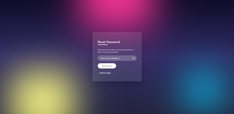
How to Build a Beautiful Glassmorphism Forgot Password Page in 3 steps
Glassmorphism is a modern UI design trend that uses semi-transparent elements, background blur, and subtle borders to create a frosted-glass effect. It adds depth and a premium, futuristic look to web interfaces, especially login forms and dashboards.
The glass effect relies on the backdrop-filter CSS property, which is supported in most modern browsers like Chrome, Edge, Safari, and newer versions of Firefox. Older browsers may still display the form, but without the blur effect.
Yes, absolutely. This login form is built using pure HTML, CSS, and JavaScript with no external dependencies. You can freely customize and integrate it into personal, educational, or professional projects.
The eye icon uses a small JavaScript function to toggle the input type between password and text. This allows users to show or hide their password for better usability and fewer typing errors.
Yes. The layout uses flexible sizing and modern CSS techniques that work well on both desktop and mobile screens. You can further improve responsiveness by adding media queries for smaller screen widths.